Here are 3 of our favorite illustrated logo designs to draw inspiration from.
1. Firefox
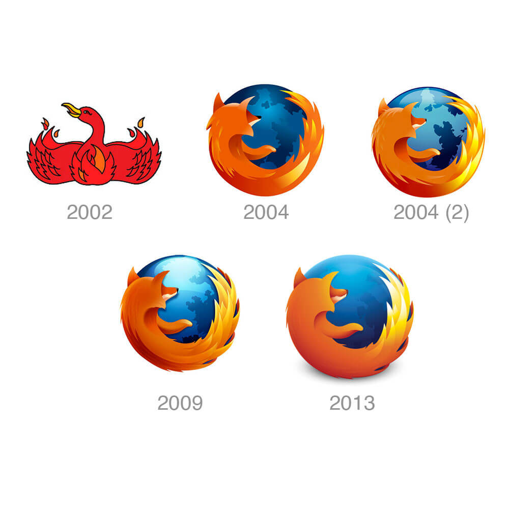
Firefox is not just known around the world for its web browser, but is also recognized as one of the most stylish logos of the internet era. The logo, which integrates the ideas of ‘fox’, ‘fire’, and the world wide web, was originally based on a concept from Daniel Burka, sketched by Stephen Desroches and then rendered by Jon Hicks using Fireworks MX. Despite going through several iterations in the past few years, the core concept of the logo remains as strong and eye-catching as ever. Read more about the story behind Firefox’s logo design in this article here.
2. Mailchimp
The friendly cartoon monkey has become synonymous with the email marketing company, Mailchimp. The original logo was designed by Ben Chestnut when he founded the company in 2001, but he was never really satisfied with the design. So in 2008, he hired Jon Hicks (designer of Firefox logo) to design a new version, featuring a 3D illustration of the Mailchimp monkey.
3. Malibu
Featuring serene palm trees set against a golden sunset, the above illustration perfectly captures the warmth and energy of the Carribean. Unlike other logos in this list, the Malibu logo design has largely remained the same over the years. The last change was done in 2013 when its parent company, Pernod Ricard, revamped both the typography and illustration of the logo. Learn more about the logo revamp here. Do you have any favorite illustrated logos? Share your thoughts in the comments section.
7 Marketing Lessons I Learned from “Hooked” by Nir Eyal 12 Best Content Marketing Podcasts to Listen to Now 15 Best Marketing YouTube Channels (That Are Worth Subscribing To)


